Design & Education
I make learning fun.
I mix design, illustration, and storytelling to build tools people actually enjoy using. Whether that’s retro Māori language games, interactive characters, or cultural resources for Te Wānanga o Aotearoa.
My background’s in education and creative tech, so I’m always looking for ways to make learning stick while keeping it playful.


Te Wānanga o Aotearoa
At Te Wānanga o Aotearoa I’ve worked as a senior designer, creating resources that make learning te reo Māori more engaging, accessible, and flexible for tauira. My mahi has spanned illustration, video, coding, and interactive design, with a focus on giving instructional designers a toolkit they can adapt to their own teaching.
Pepeha Maker – I designed this interactive tool in Articulate Stroyline with a paper collage aesthetic to echo the act of piecing together a pepeha from shared landmarks and whakapapa. I recorded the narration myself and reshaped it with AI to bring depth to the voice. Behind the scenes, I coded functionality that lets users export a stylised version of their pepeha, so the process ends with something personal and shareable.
Please try out the pepeha maker yourself and pick a branching scenario based on whether you are Māori or non-Māori. Export your pepeha as an image or a PDF at the end.
Video formats – To modernise teaching resources, I created two distinct video approaches. The first uses custom Adobe Character Animator puppets I illustrated, giving presenters a way to “step inside” the learning material with engaging animated avatars. The second blends static illustrations, music, text overlays, and b-roll footage, creating cinematic explainer videos that deliver abstract concepts in a clear and memorable way.
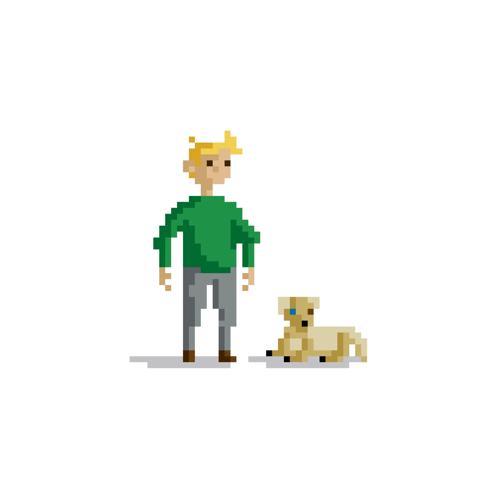
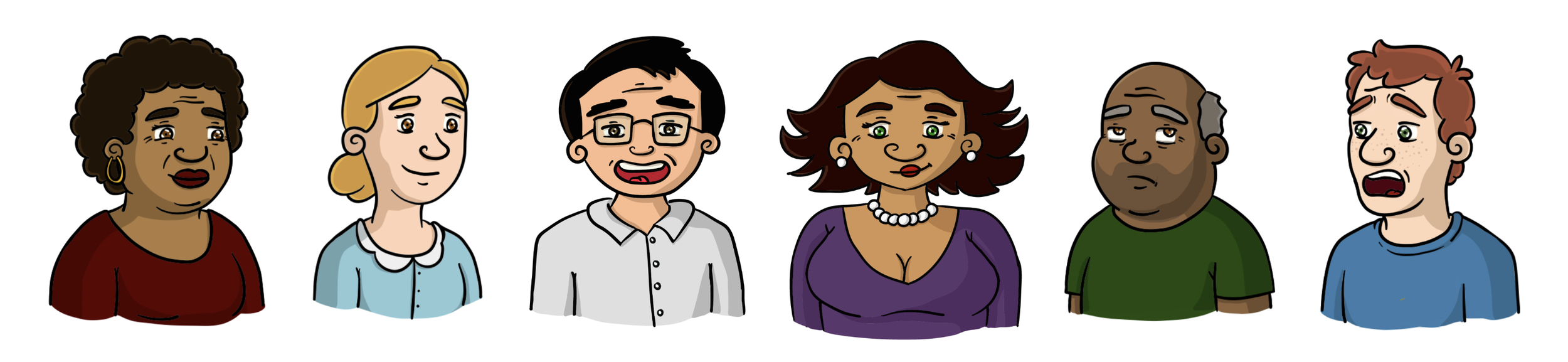
Character kit – I illustrated a library of characters with multiple poses, expressions, and cultural grounding, allowing instructional designers to easily build stories and resources without starting from scratch. This kit provides flexibility and scalability, making storytelling a central, repeatable part of resource design.
Interactive activities – I built H5P activities such as hotspots, drag and drop assessments, game boards and branching pathways, letting tauira actively explore, click, and test their understanding rather than passively absorb information. These are lightweight to use, but they change the dynamic of learning—turning static material into something interactive and exploratory.
Click on the different hotspots in the H5P activity on the right to try it out. Make sure to turn your sound on.
Language games – I coded several reo Māori games styled after old-school arcades and choose your own adventure books to appeal to our older demographic using nostalgia. Learners can pick up vocabulary and sentence structures while playing. Whether it’s dodging, collecting, or branching through a story in a “choose your own adventure” format. These games sit at the intersection of fun and pedagogy, showing how retro mechanics can be re-imagined for language revitalisation.
Click on the The screen of Manu flight and Taniwha quest then use space and the directional keys to test your reo knowledge.
Try choosing your own adventure at the fish and chip shop below and to the left.
Infographics & posters – Alongside digital projects, I’ve designed visual resources such as posters and infographics that distil complex language points into bold, accessible formats. These are designed to work both in classrooms and online, reinforcing the kaupapa with clear design thinking.
Through this mahi I’ve explored how illustration, storytelling, and technology can be woven together to support kaupapa Māori education. It’s been an opportunity to experiment, prototype, and build systems that are not just visually engaging but also empower kaiako and tauira alike.


Little Libraries
Little Libraries is a nationwide initiative by The Values Trust to make books more accessible and exciting for tamariki. The goal is simple but ambitious: reach 100,000 kids, especially in communities where books aren’t always easy to come by. I was brought on as Creative Lead to help bring that vision to life.
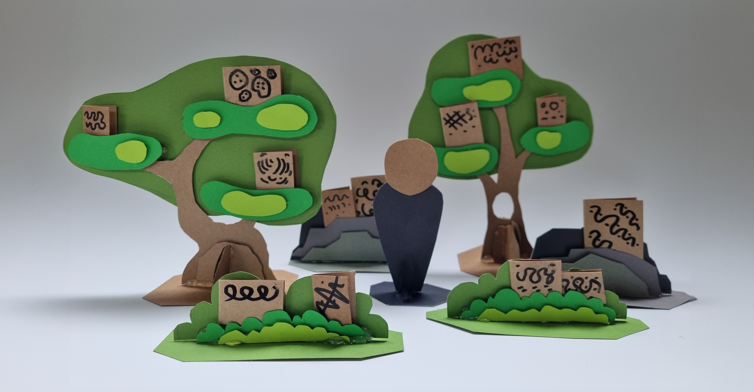
My role began with designing and prototyping the kitset forest libraries; modular shelves shaped like trees, shrubs, and rocks. They’re more than storage: they double as play environments, inviting kids to climb into the world of books and even use the pieces as props in their own storytelling.
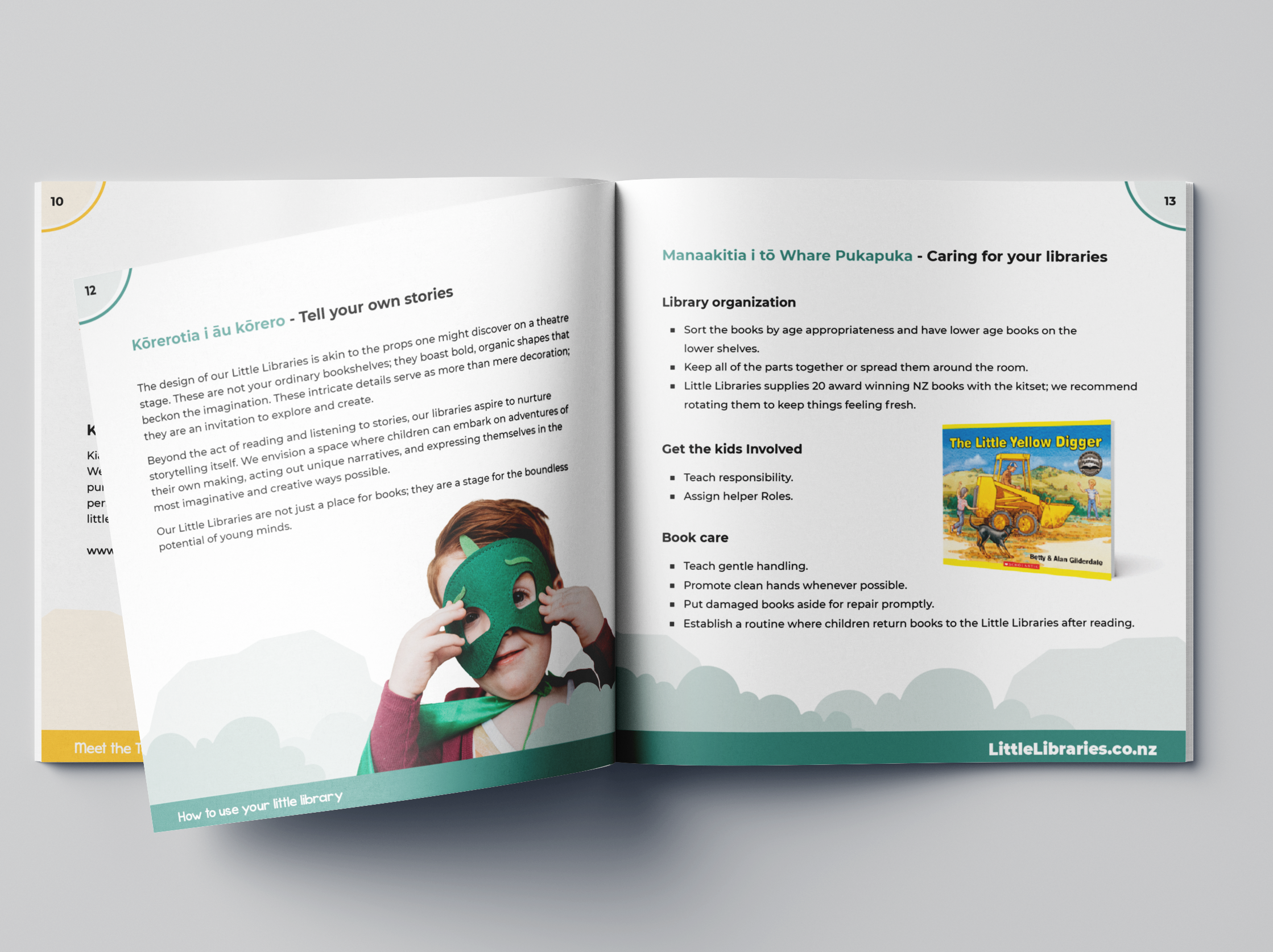
From there, I developed the brand identity and created the project mascots; two kids, a tuatara, and a moa, designed to be playful companions that children could connect with. I also built the website, wrote and illustrated the user guide, and ensured the look and feel carried across every touchpoint.
I worked closely with early childhood experts, Play’n’Learn, and the Public Libraries of NZ to balance imaginative design with practical needs in busy ECE centres.
The impact has been clear: an independent evaluation found tamariki are reading more often, kaiako and whānau are joining in, and 92% of centres say they’d recommend the libraries to others . Teachers describe the libraries as “bringing classrooms to life” and creating dedicated quiet spaces where kids naturally gravitate towards books.
For me, the project reinforced how much I love designing for children and education. It showed that creativity can shift behaviour — not just how a space looks, but how it’s used and valued every day.


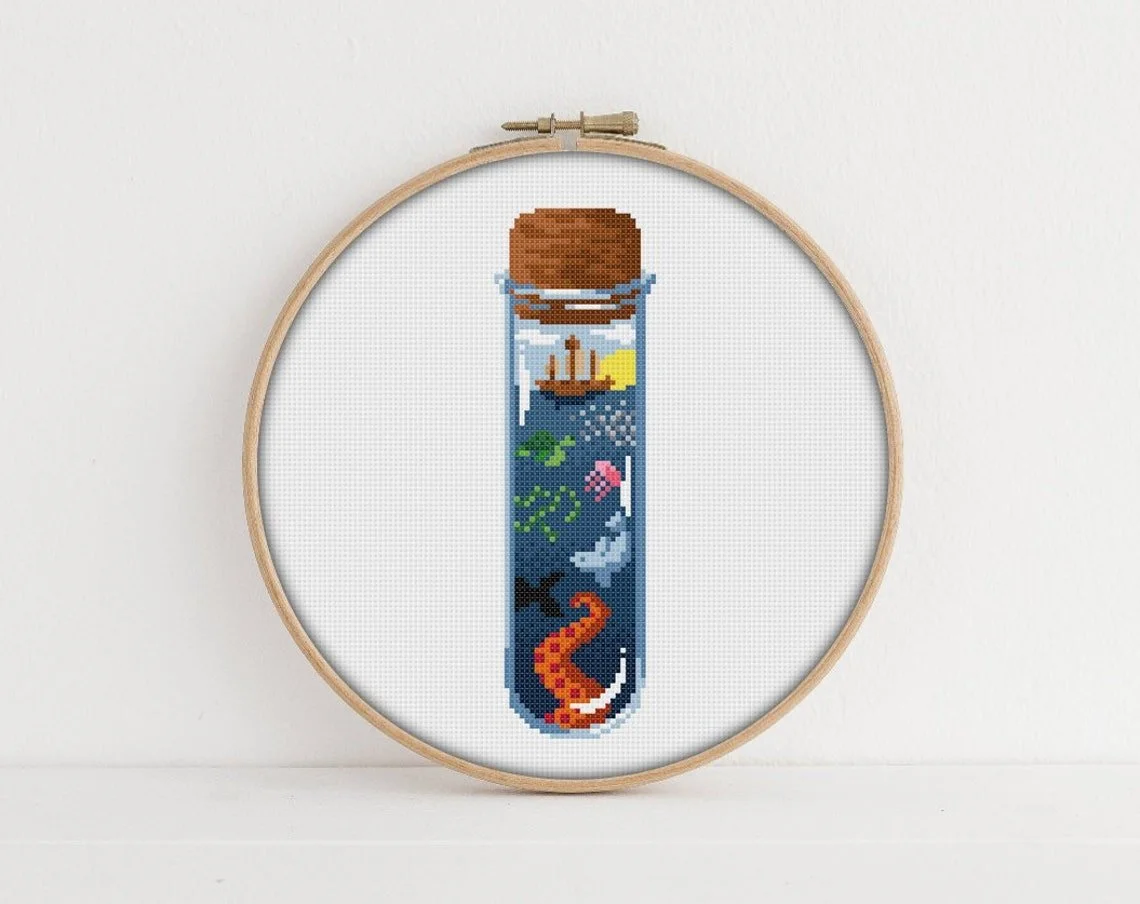

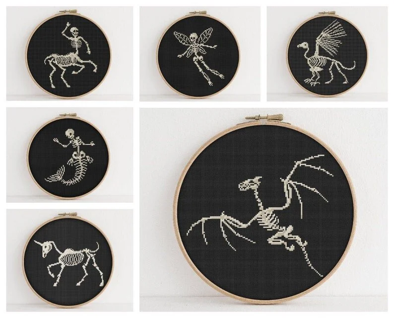
PixlStitch
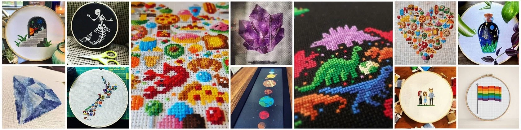
PixlStitch is my ecommerce store, which offers unique and creative embroidery instructions in the form of pixel art. Since its launch in 2016, my store has grown to feature over 120 original illustrations and has generated a dedicated following of over 10,000 customers worldwide. My success in the e-commerce industry is exemplified by the over 9,500 sales generated by PixlStitch.
In addition to my e-commerce experience, I am also a published author, having released an instructional book on designing unique characters through Schiffer Publishing Ltd in 2021. My experience with PixlStitch has not only allowed me to showcase my design skills, but also taught me valuable lessons in e-commerce, marketing, customer relations, and niche design.
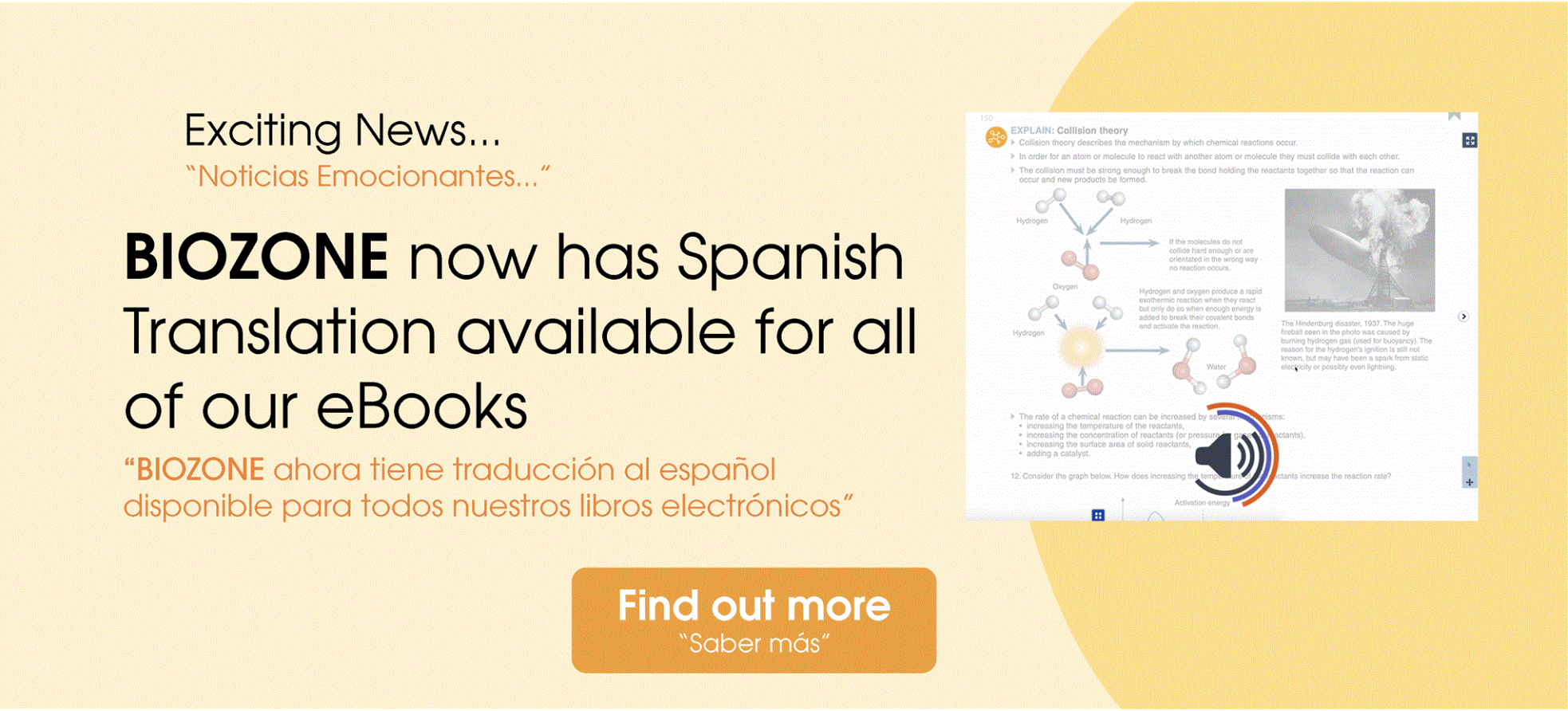
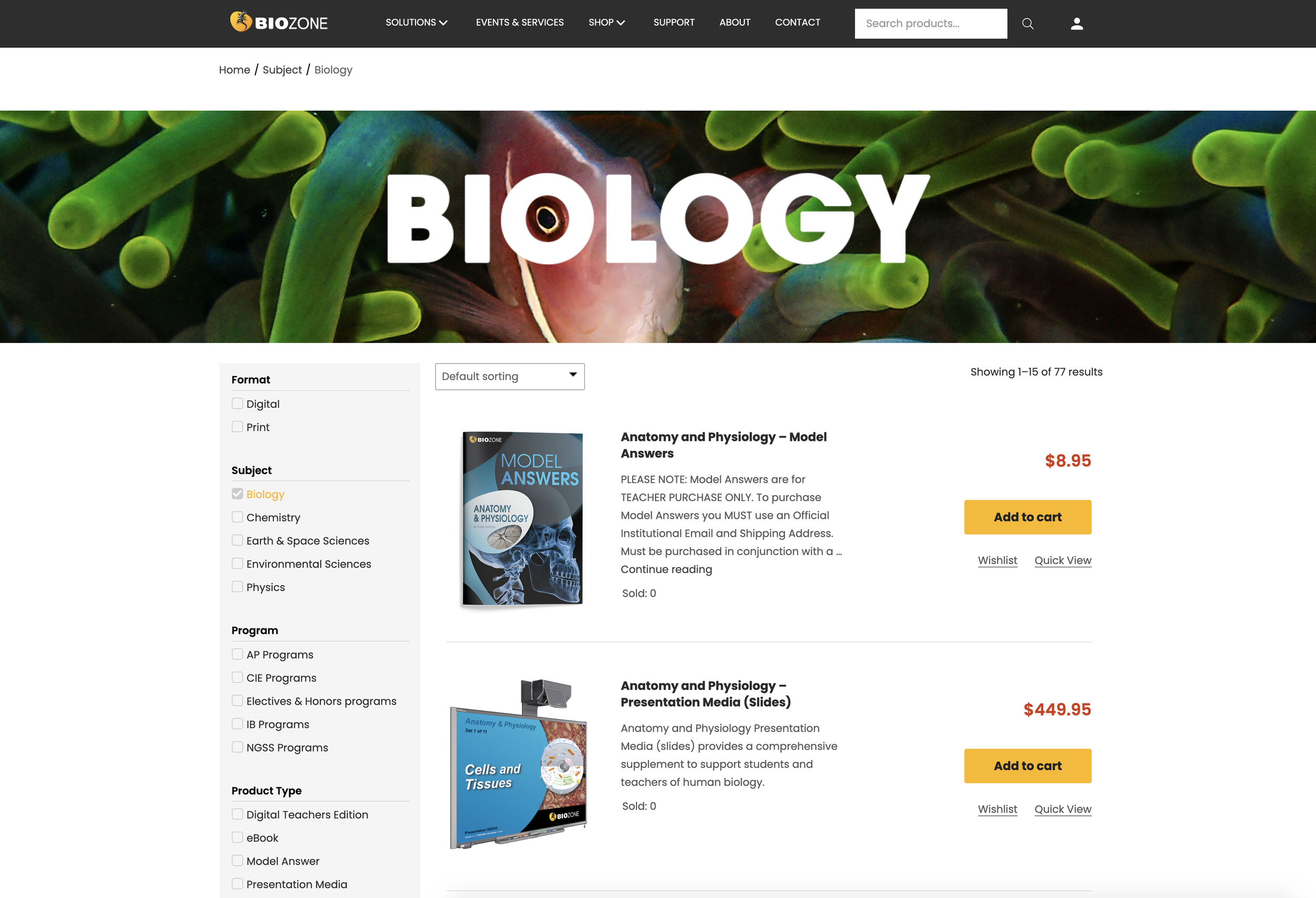
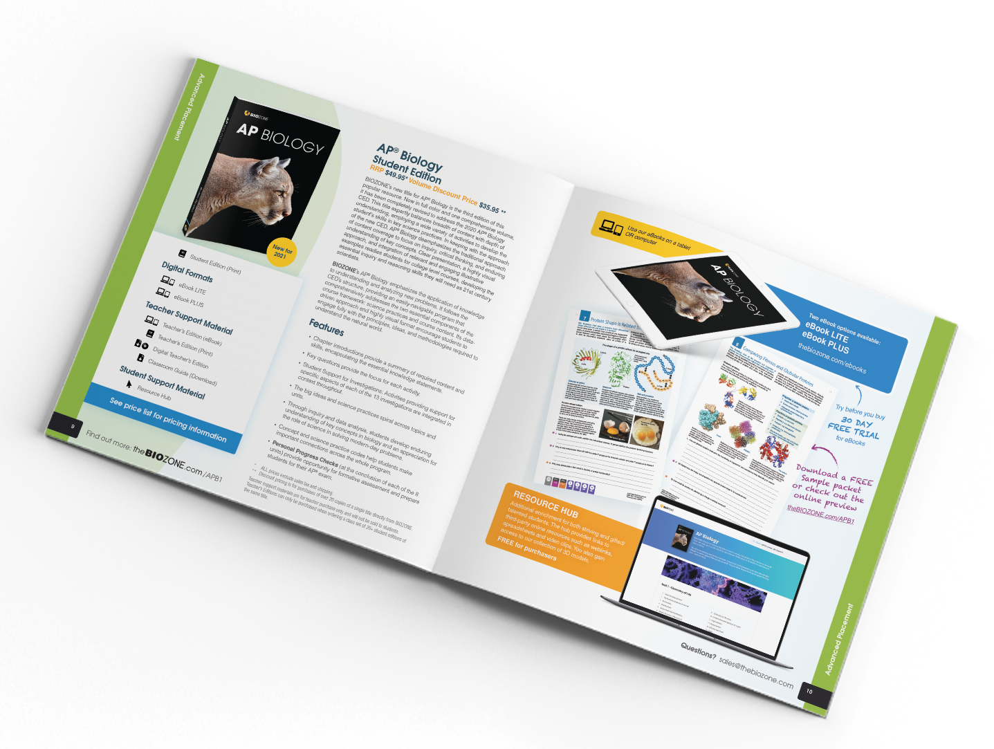
BIOZONE
As a Graphic Designer at Biozone, an international textbook publishing company, I had the opportunity to flex my creative muscles in various design realms. This included crafting marketing materials, designing eye-catching book covers, developing engaging websites, preparing print files with precision, and maintaining brand consistency across all projects.
My hands-on approach allowed me to effectively execute Biozone's in-house printing, producing striking product imagery. Working in this dynamic environment helped fine-tune my skills in industry-standard tools like InDesign, Illustrator, and Photoshop.
My time at Biozone was a period for growth and collaboration. I'm proud to say my team pushed me to create a meaningful impact and contribute to the company's success. It's been an fantastic journey that's strengthened my abilities and shaped me into a versatile creative professional.


Successful Kids Resources
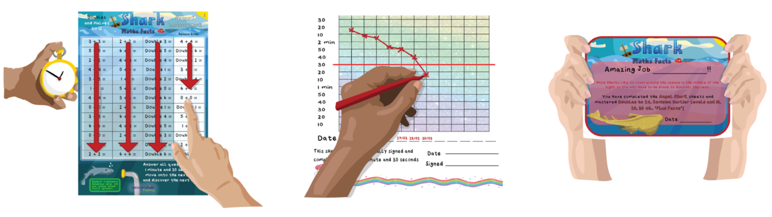
Successful kids Ltd is a Hamilton based tutoring company. They approached me to design educational material that separated itself from the current resources on the market.
The problem here was to create a series of maths programmes that children felt compelled to engage with and progress through beyond a teacher telling them to do so.
I utilized vibrant palettes, storytelling, Illustration, a reward based system, and progress marker graphs. Gamification like this is used to generate excitement and engagement for users with a variety of interests.
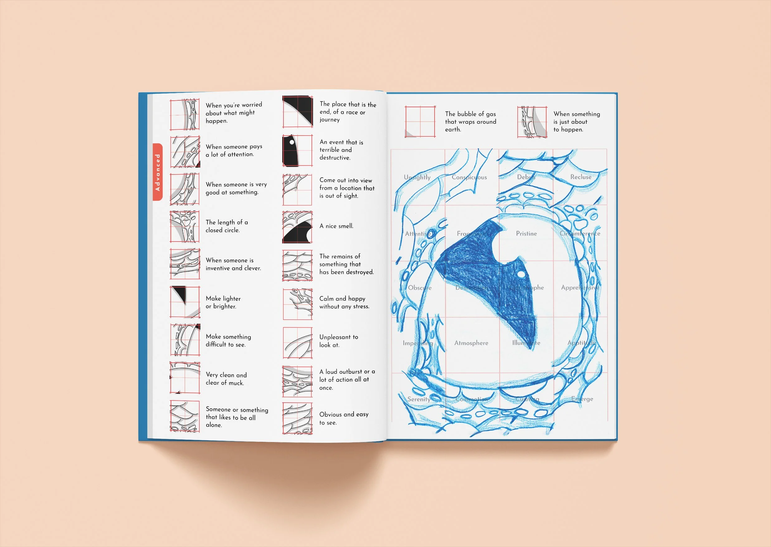
VocabuDoodle
VocabuDoodle is an educational resource I designed to help combat the decline of literacy and vocabulary in modern children.
The challenge here was to create something intrinsically motivating for children that could compete with the distractions of the modern world in levels of engagement.
I did this by incorporating gamification, science backed bite-sized storytelling, and interactive self checking art activities. Part of the motivation for using a publication over digital was for children to experience making marks on something tangible as opposed to interacting with a screen. Pencil to paper, for fun, has become a novelty in the digital age and as such, feels fresh and new for kids.
The cartoony doodle style illustration was used to set the tone for the interactive element. Key vocabulary is highlighted throughout the story. Users are prompted to contextualize this vocabulary using the stories they read and fill out the drawing grids by matching definitions correctly. Similar to a cross word but with art, kids will know whether they have the correct answer if the drawings align. The art and tone is designed to feel accessible and achievable for the demographic prompting them to give it a go.
All of which was utilized with the overall goal of building vocabulary and improving reading comprehension.


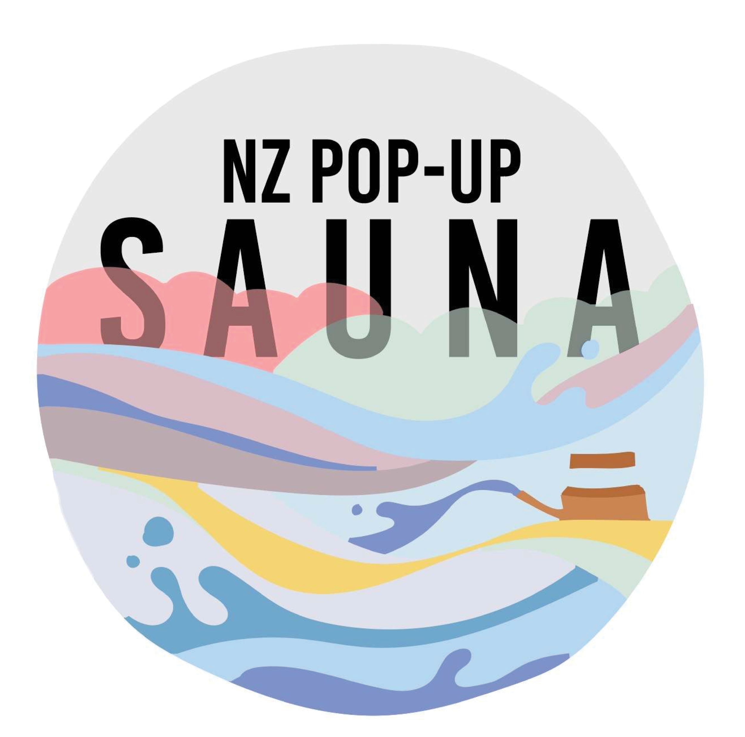

Brand Design
I have taken on a number of freelance brand design projects and adapted my style to fit a variety of tones and brand values.
The examples shown here range through,
Sage, a gardening business.
NZ Pop up Sauna, a container based sauna that is located on the Wellington waterfront during winter.
Olive Thrift, a vintage clothing reseller.
Hopper Home, an eco store based in the Wellington CBD.
Tiny House Campers, a Waikato based camper van rental company (the below image is their van decal.)


I would love for you to get in touch if you feel we might be a good fit for working together.
Johnystoof@gmail.com
022 453 4651